Brutalist Artisanship
While kollokium’s designs are meant to evoke a sense of industrialism and rawness, behind the avant-garde object is a tremendous amount of manual, meticulous handwork. And because there’s no equivalent to base our work on, we end up having to find creative solutions to problems no one has encountered before. While we wouldn’t consider ourselves champions of traditional handcrafts, our watches require specialized hands and talent to materialize. We call it brutalist artisanship.
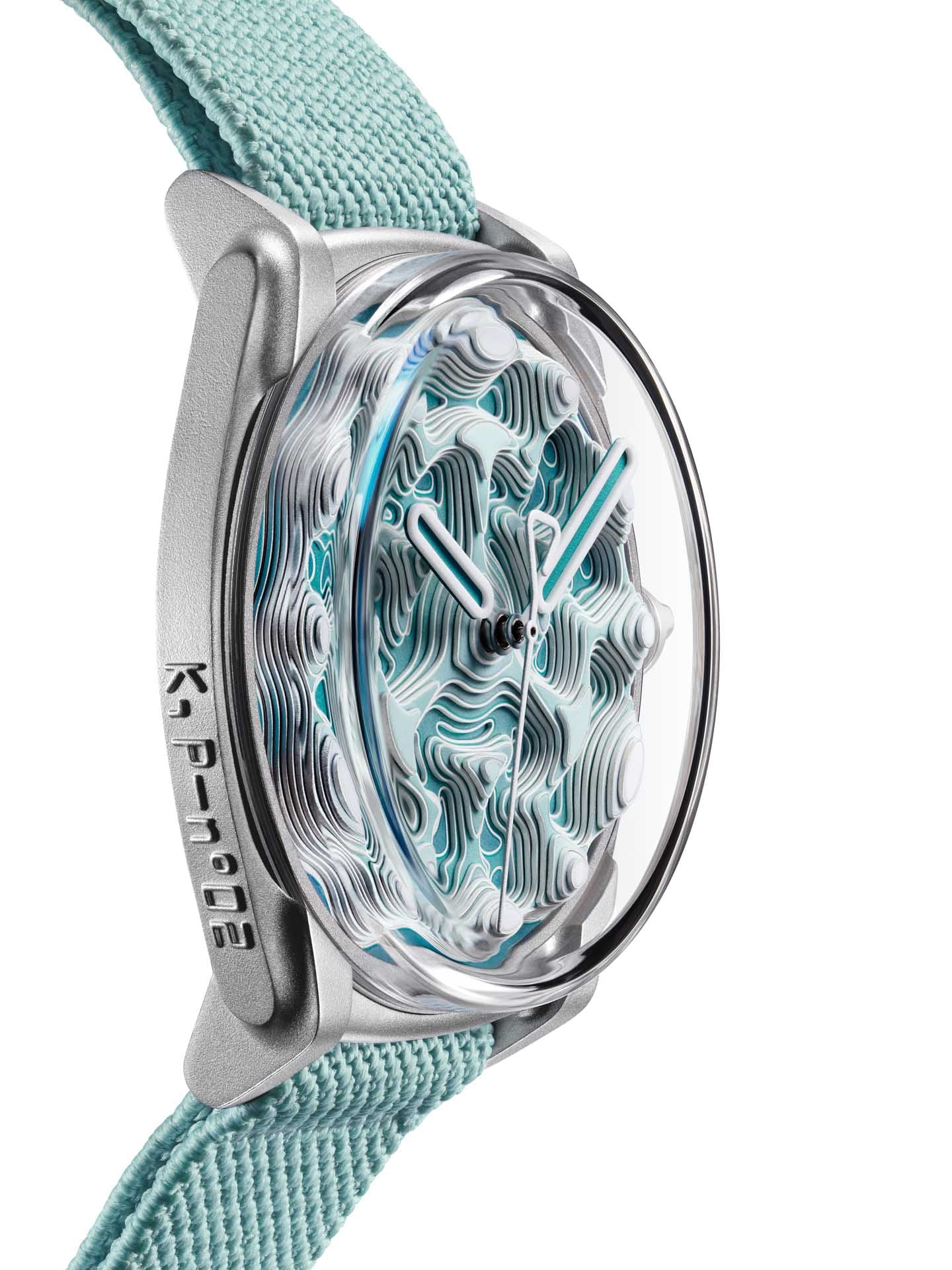
Projekt 02’s topographical dial is made in nine layers, composed of sixty-seven individual dial plates, which are individually hand-painted with a mix of lacquer and Super-Luminova, carefully avoiding the metal contours. These plates are then vertically stacked and pegged on top of each other, one at a time. It takes around 6 hours to assemble a single dial, and the plates can be prone to bending when pressed together, causing the entire dial to have to be discarded and the work starts all over again. Oh, the poor dial-makers…